Introduction
In this section of the design system, we will see a set of basic good practices to ensure that a text will be readable, attractive and will guide the user.
One of the key aspects of creating readable text is selecting appropriate fonts. This can include choosing font families that are easy to read on digital screens, and selecting a range of font sizes and styles that are appropriate for different types of content and contexts. Additionally, users should be able to customize their font selection, by choosing from a variety of options and adjusting the size, weight, and spacing of the text.
In addition to guidelines and best practices, this section of the design system also provide a guide to font sizes for different devices, such as mobile, tablet, and desktop. This include information on font sizes for different types of content, such as headings, body text, and button labels.
Principles
General basic rules
For easy reading, we want to avoid text blocks stretching from one side of the screen to the other, especially for laptops and desktops. We try to limit the number of characters per line to 90 as much as possible.
The ratio between heading and paragraph font sizes is based on the golden ratio.
By default, the line spacing is 125%.
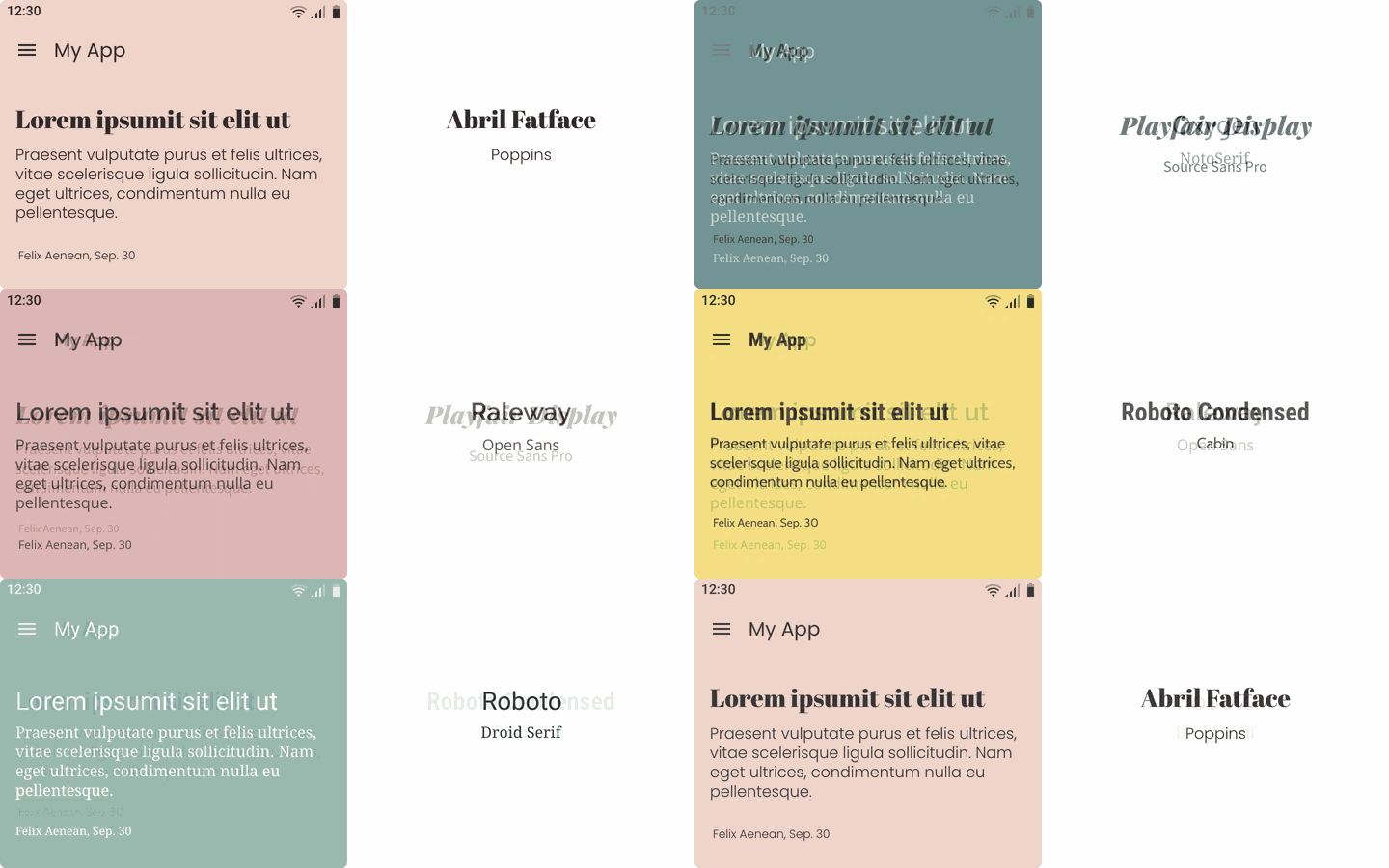
We will try to limit the number of fonts to 2 for the views. A limited choice of font families will ensure the consistency of an app, it also allows for a clear hierarchy of information.
This practice is called Font Pairing, some examples below:
Flexibility
Responsiveness
By default, the font size adapts automatically to the devices.
We have set one size for mobiles, one for tablets and one for wide screens (laptop & desktop).

Preset text sizes
In addition to this automatic adaptability, the user can choose between 3 preset text sizes: Small, Medium, Large.

Customization
In addition to the font families proposed by the predefined themes and sizes, users can choose other character families to personalize their app.

Text levels
Classification
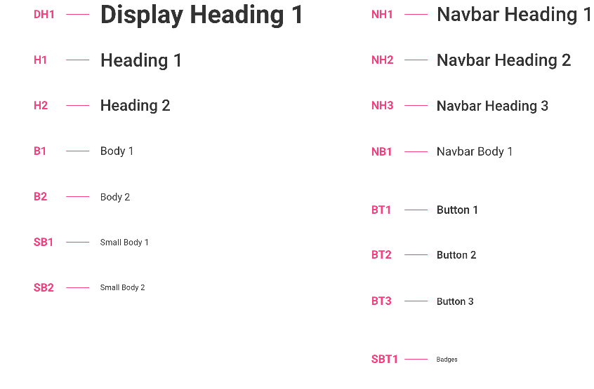
Here we talk about the hierarchy between the different levels of texts. In the table below:
Left column: for content elements such as titles or body text, the text size changes depending on the device and the user’s choice.
Right column: for interface elements (navigation, buttons etc.) the sizes vary only according to the user’s choice, not the device.
Indeed, in these cases we are restricted by the size of the components themselves and to ensure a correct display in all circumstances, we must frame the size of the fonts more precisely.
Please refer to the table at the bottom of the page to see in detail all font sizes used.
Exemples of uses
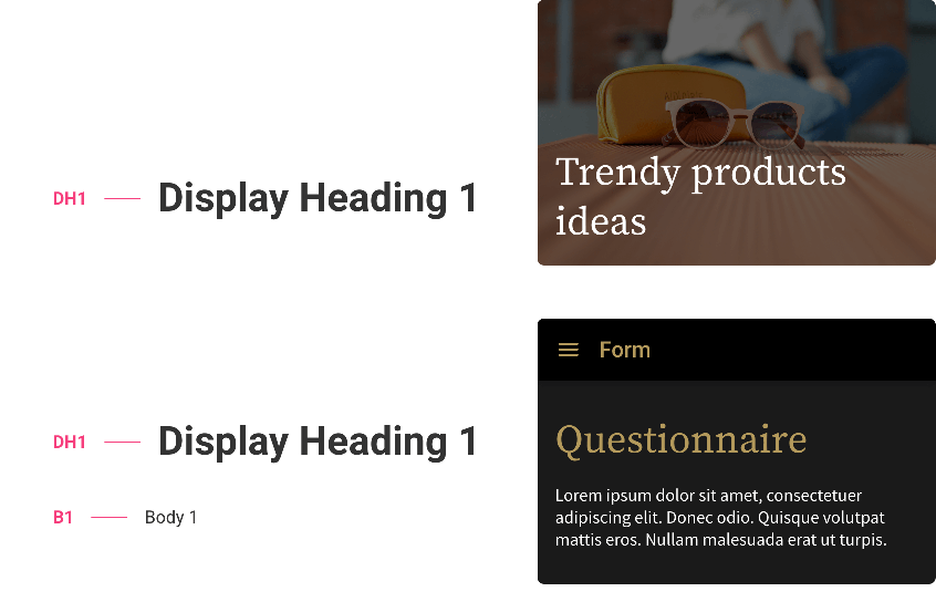
DH1 - Display heading 1
This is the largest font size. It can be found in "Headline highlight" templates and sometimes also in Detail sections, in which case it is associated with B1.
The examples below are taken from the templates Widget Article Highlight Une Grid (Mobile, Text Medium) and Section Form (Mobile, Text Medium)
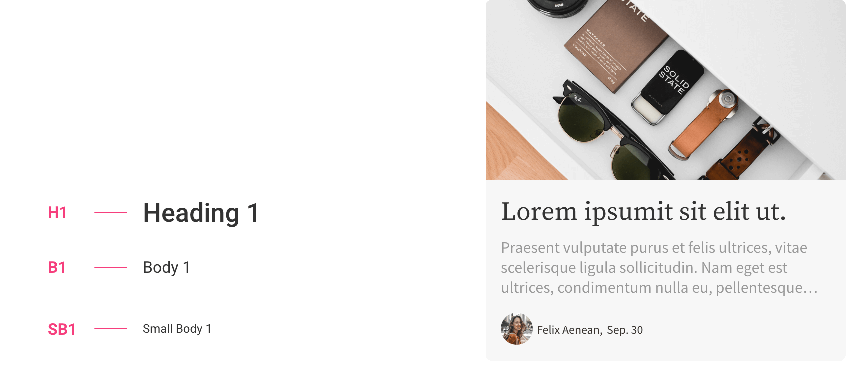
H1 - Heading 1
This type of heading is used in the Detail sections, but also in the widgets and Headline lists. It is associated with B1 and SB1*.
The example below comes from the template Section Article List Classic Une (Mobile, Text Medium):
H2 - Heading 2
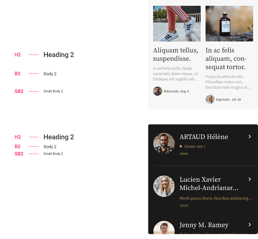
The H2 / B2 / SB2 combination is found mainly in list widgets and list sections.
Below: Section Article List Grid (Mobile, Text Medium) and Section Chat List (Mobile, Text Medium):
NH1 - Navbar Heading 1
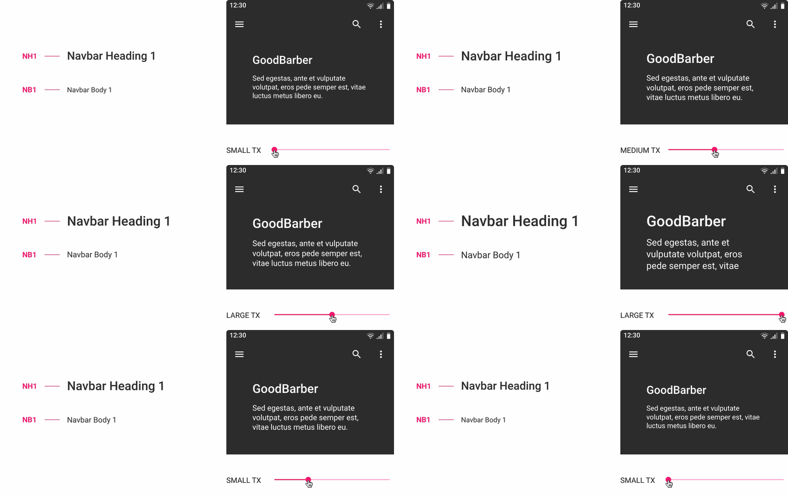
In the example below the user has chosen the largest navigation size on mobile, he can also vary the font size which will be the same for tablets and screens.
NH2 - Navbar Heading 2
Here the chosen navigation size is MEDIUM:

NH3 - Navbar Heading 3
The smallest navigation size

⚠️ In the example above, the "cancel" and "save" actions use the classic SB1 text size that varies depending on the device.
Please refer to the table at the bottom of the page to see in detail all font sizes used.
BT1 / BT2 / BT3 - Buttons
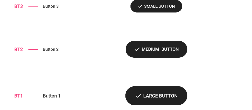
The user can choose between 3 button sizes.
For each button size we have a different text size, but this one does not vary according to the devicesFor more information on the buttons, please refer to Button component.
BT1 / BT2 / BT3 - Others
We reuse the text sizes used for the buttons above for elements such as labels, chips, floating action button text.

The following items only exist in one size:
BT1 - Infos
Items such as the information contained in the thumbnails will be one size : Number of views, Distance, Duration etc.

SBT1 - Badges
This is the smallest size used. On all devices and whatever the user has chosen, the font size of the badges will be the same.

Font Size Reference Table
As we saw, we change size according to the devices, but also according to the user's choice, except for navigation (NH1, NH2, NH3), buttons (BT1, BT2, BT3) and badges (SBT1).
The table below references all font sizes used for all templates:
Example : B2 TM (Body 2 / Tablet / Medium text size) = 15 pt — Line spacing 18,75
 Design