Introduction
The Text Field component is a fundamental element in any design system, as it allows users to input and submit text-based information. It is a versatile component that can be used in a variety of contexts, from forms and surveys to search bars and chat interfaces.
The Text Field component in the GoodBarber design system likely includes a variety of different options to suit different use cases, such as different sizes and types, as well as support for multiple lines of text. Additionally, it likely follows a consistent set of design principles to ensure that it looks and feels like a cohesive part of your app design, including things like consistent spacing.
Anatomy
The Text Field component exists in 3 sizes (Small, Medium, Large) and 2 types (Title UP and Title IN). It can be on 1 line or several lines. Despite the many variations of the component, some design principles are constant.
Title UP
Common design principles
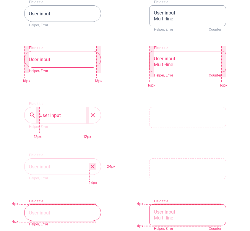
The spacing and the size of the icons are the same for the 3 sizes of the component:
| Single Line | Multi-Line |
|---|---|
| ↓ | ↓ |

Field Height: Single Line
For this Title UP version of the component, the height of the field does not vary according to the content, but according to the size chosen (Small, Medium or Large).
| Mobile | Tablet | Web |
|---|---|---|
| ↓ | ↓ | ↓ |
Small
Medium
Large
Field Height: Multi-Line
The height of the field depends here on its content. We add a top and bottom padding whose value depends on the chosen field size:

| Small | Padding Top / Bottom | ▸ | 12 px | |||||||
| Medium | Padding Top / Bottom | ▸ | 16 px | |||||||
| Large | Padding Top / Bottom | ▸ | 20 px | |||||||
| Mobile | Tablet | Web |
|---|---|---|
| ↓ | ↓ | ↓ |
Small
Medium
Large
Title IN
Common design principles
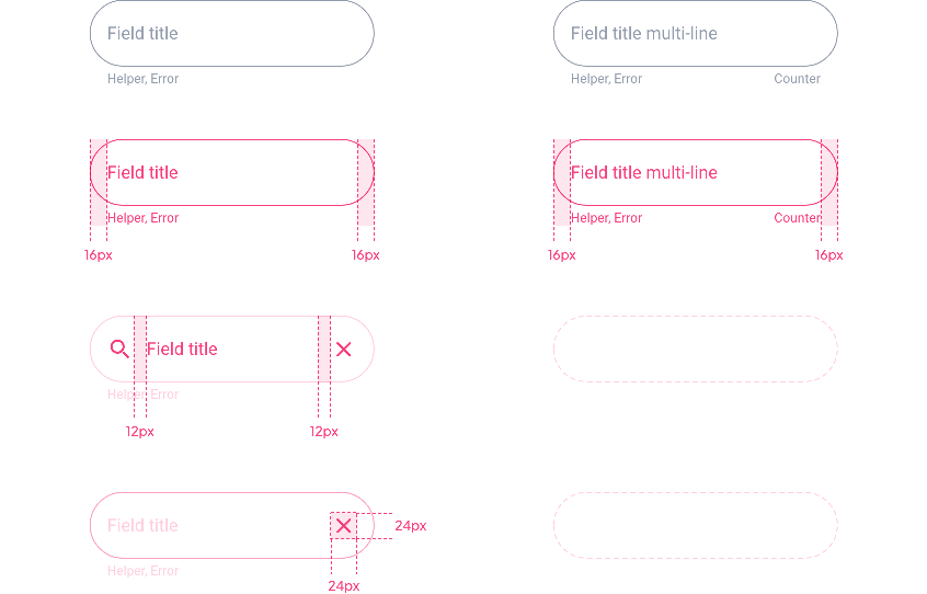
The spacing and the size of the icons are the same for the 3 sizes of the component but for this Title IN version, the display changes according to the state of the component:
- Disabled / Inactive → Field Title
- Focus / Complete / Error → Field Title + User input
| Single Line | Multi-Line |
|---|---|
| ↓ | ↓ |
Disabled / Inactive states
Focus / Complete / Error states
Field Height: Single Line
For the Disabled and Inactive states, only the Field Title appears, however, the height of the field will be that of the Focus, Complete and Error state which include the Field title and the User input:

| Mobile | Tablet | Web |
|---|---|---|
| ↓ | ↓ | ↓ |
Small
Medium
Large
Field Height: Multi-Line
The top/bottom padding value depends on the chosen field size:

| Small | Padding Top / Bottom* | ▸ | 8 px | |||||||
| Medium | Padding Top / Bottom | ▸ | 12 px | |||||||
| LArge | Padding Top / Bottom | ▸ | 16 px | |||||||
| Mobile | Tablet | Web |
|---|---|---|
| ↓ | ↓ | ↓ |
Small
Medium
Large
Font Size
The Font size changes depending on the devices and the choice of the component size.
You can have an overview of the different versions of the Text Field with the corresponding font sizes in the file at the bottom of the page.
| Component Size | Text Level | Mobile | Tablet | Web | ||||||
|---|---|---|---|---|---|---|---|---|---|---|
| Small | Body 1 | 14 | 15 | 16 | ||||||
| Small Body 1 | 11 | 12 | 12 | |||||||
| Medium | Body 1 | 16 | 17 | 19 | ||||||
| Small Body 1 | 12 | 13 | 13 | |||||||
| Large | Body 1 | 19 | 21 | 22 | ||||||
| Small Body 1 | 13 | 14 | 14 |
Properties
Shape
Below, the Shape atom applied with the types Sharp / Rounded / Round for the fields on 1 line:

When we have several lines, we go from a radius of 50% of the height of the component to 12px.

Border
By default, the Border Atom value is 1px for all states except Focus and Focus Error:
| Disabled / Inactive / Complete / Error | Focus / Focus Error |
|---|---|
| ↓ | ↓ |

Shadow
The Shadow level changes for the Focus and Focus Errorstate: in fact, we go to the higher level to accentuate the elevation and thus highlight the activated component.
⚠️ Caution, the Inner Shadow option is not available for Focus and Focus Error, we will use Drop Shadow.
| Disabled / Inactive / Complete / Error | Focus / Focus Error |
|---|---|
| ↓ | ↓ |


Layout
Form
Depending on the device, the layout of a Text Field associated with a button may vary.
On Mobile, the 2 components are one on top of the other because of the lack of space. The button occupies the whole width of the page :

On Tablet and Web, if the 2 components are one above the other the button will have its minimum length. If they are on the same line, the Text Field occupies the space left by the button:

To know the spacing between the fields and to see how they behave in the layout of a form, please refer to the Form Layout section.
Behavior

States
| Title UP | Title IN |
|---|---|
| ↓ | ↓ |
Disabled
Inactive
Focus
Complete
Error
Error Focus
Preview
Below a preview of the XD file, we find:
- The 3 component sizes Small / Medium / Large
- The corresponding font sizes
- The 2 options Title IN and Title UP
- The 3 shape options Sharp / Rounded / Round
- Technical specifications for each field type
- 2 states: Inactive and Complete
 Design