Introduction
The Form component in the GoodBarber design system is a tool for gathering user input and data. This component provides a user-friendly and visually consistent way to create forms, allowing users to easily fill in and submit information. Whether you need to collect contact information, survey responses, or other types of data, the Form component makes it easy to create professional-looking forms that are optimized for mobile devices.
With support for a wide range of form elements, including text fields, checkboxes, radio buttons, and more, the Form component is a versatile and flexible solution for creating forms in your app.
Additionally, it has a wide range of options for styling, validation and error handling, which can be used to ensure that the form is easy to use and provides an intuitive experience for the user.
Properties
Shape
Below, the Shape atom applied with the types Sharp / Rounded / Round.
| Title UP | Title IN |
|---|---|
| ↓ | ↓ |
Sharp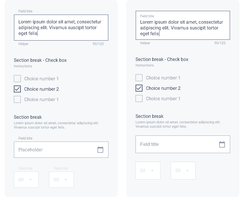
Rounded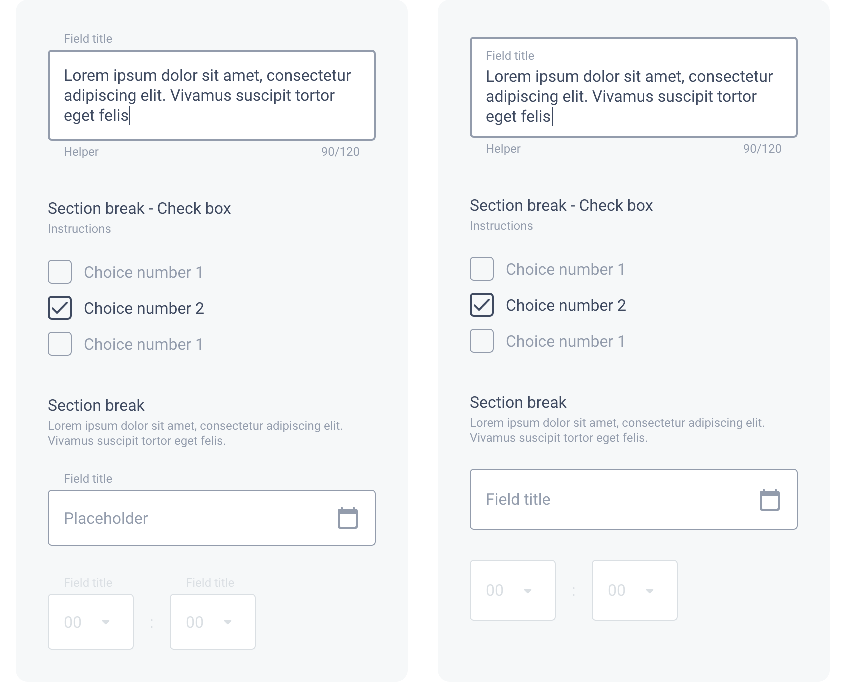
Round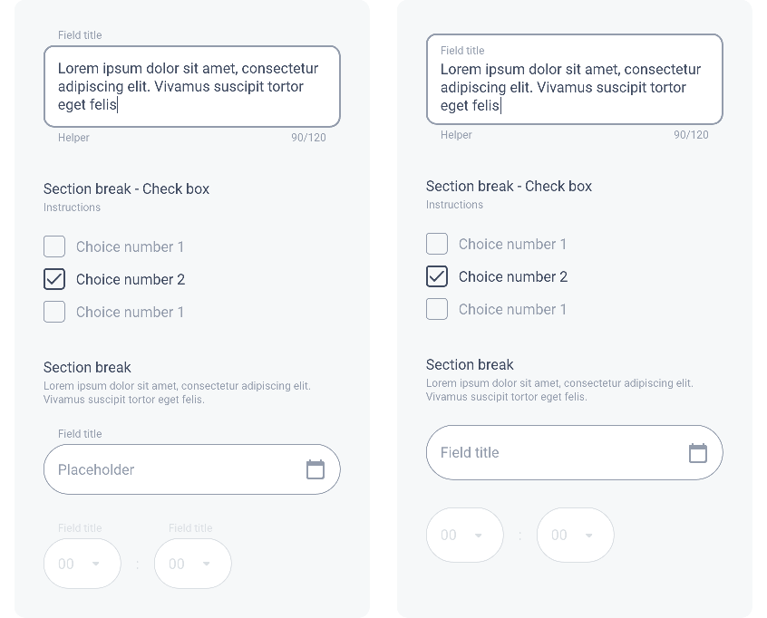
Border
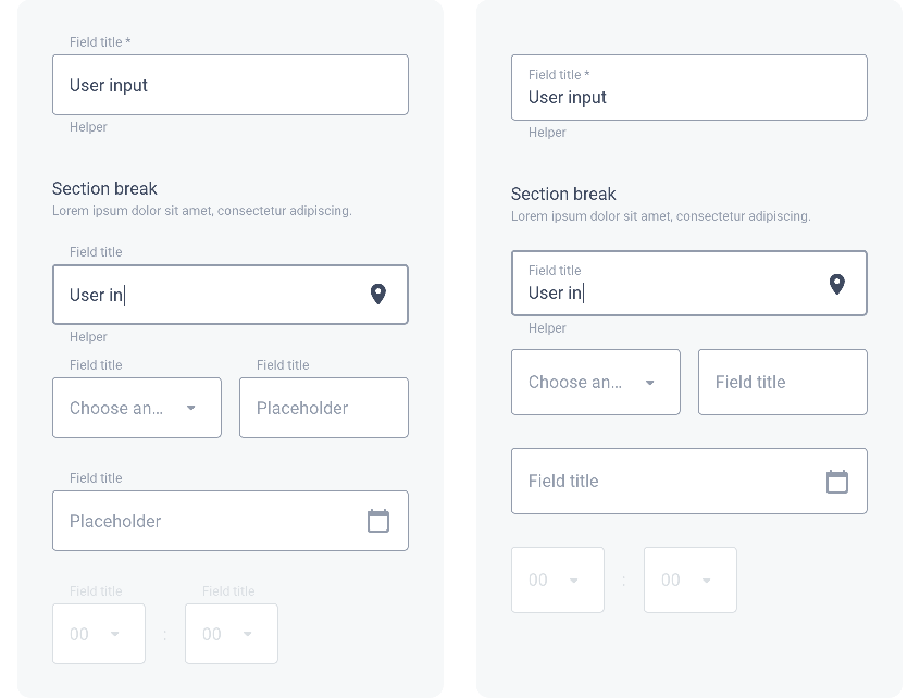
In the example below, we see the Border atom in a Form. The Focus and Focus Error states are differentiated by their thickness of 2px (the default value is 1px).
All the states of a Text Field are described in the section Text Field / Behavior.
| Title UP Round | Title IN Round |
|---|---|
| ↓ | ↓ |
Shadow
The level of Shadow changes for the states Focus and Focus Error. All states of a Text Field are described in the section Text Field / Behavior.
Drop Shadow
Shadow level 1 (Focus level 2)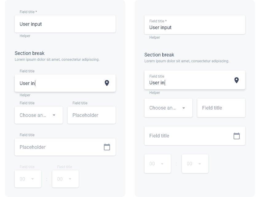
Shadow level 2 (Focus level 3)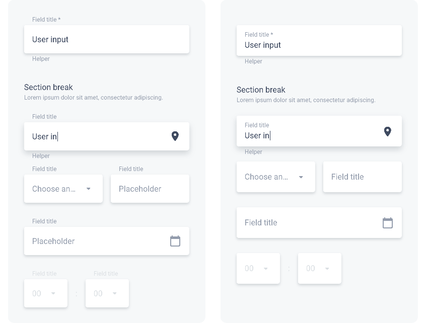
Inner Shadow
Shadow level -1 (Focus level 2)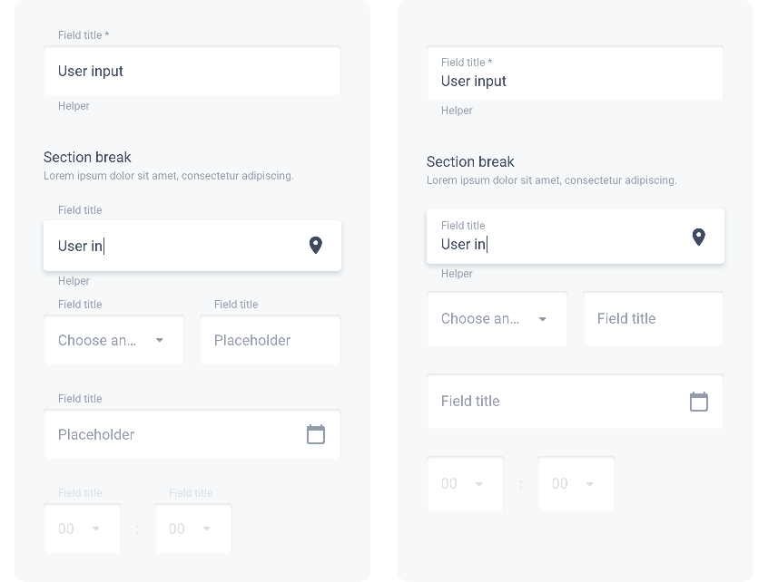
Shadow level -2 (Focus level 3)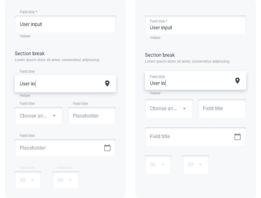
Layout
Vertical spacing between modules of a form are the same on all devices:
| ・ | Before Section Break | ▸ | 40 px | |||||||||
| ・ | Between fields | ▸ | 24 px | |||||||||
| ・ | Between fields in a group | ▸ | 12 px | |||||||||
| ・ | Between 2 fields side by side | ▸ | 1G | |||||||||
The illustration below shows the spacing between elements in a Rounded form on Mobile. Title UP option on the left, Title IN on the right:
 Design